top of page
Hıfz-ı Bedîl
This User Experience and Servise Design product branding project was tailored to meet a target audience's specific need. The process began with understanding the problem, deep research and design requirements, continued with developing the visuals, and concluded with delivering the final product in printed format, all while keeping a user-centric approach in mind.
2025
Freelancer Project
Turkey
Visual Branding
Print Design
User Experience and Service Design

Hıfz-ı Bedîl | Ezberde Temekkün Tekrarda Sebat
_______ Hıfz-ı Bedîl is a printed educational curriculum designed to support adults memorising the Qur’an through a structured daily program, with flexible options for 6, 4, 2, or 1 year plans. The specially designed kits guide students with clear daily tasks through a Program Calendar, helping them build stronger long-term memorisation, while the Program Agenda supports sustainable routines and daily follow-up.
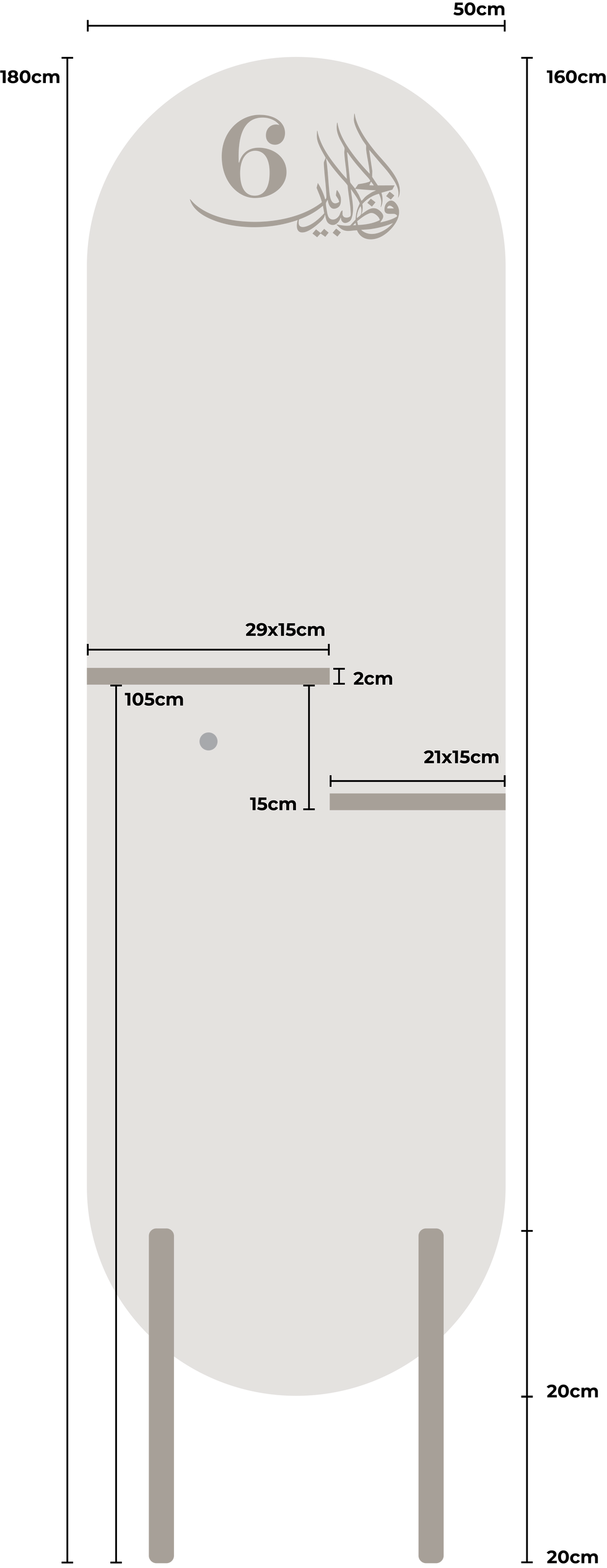
The Main Logo

The Skeleton

Project Background
The memorization method behind Hıfz-ı Bedîl was originally developed in 2014 and has been applied with students for nearly 10 years.
It combines strengths from two commonly used approaches:
-
The Arabic approach, which focuses more on meaning while memorizing, but may lack consistency in revision
-
The Turkish approach, which is strong in consistency, but often dismisses memorizing with meaning and can follow an unconventional order
Hıfz-ı Bedîl brings both together by keeping the correct page order while building a daily-based repetition system, improving consistency and strengthening memory over time.
Note: The method itself was developed by the project owner, my role began at the point of redesigning and productizing the system.


The Problem
Although the method was strong and already proven, the program experience was not accessible enough for a wide range of students. The curriculum was difficult to follow in its original format (Excel sheets), and the project needed a format that feels:
Clear and easy to track daily, Motivating to continue long-term, Suitable for different lifestyles and age groups, Respectful in quality and design (since many Qur’an programs in Turkey lack strong design attention).

User Experience & Research
To understand the real needs, I conducted Surveys and Interviews with both students and teachers, focusing on daily memorization habits, tracking struggles, and what makes them stay consistent.
The target audience is adults 18+, male and female, including: Students, university students, mothers, working mothers, working men, and people with busy routines. This wide audience was a major reason why the final solution needed to be simple, flexible, and physical.
Through research and real user feedback, we identified key needs:
-
The experience must be printed, not digital (to be accessible and practical for everyone)
-
Most users will use it at home, so the product should look premium and aesthetic, not something to hide away
-
The design must be clear, soft, and readable, because the content is long and repeated daily
-
The size needs to be portable and fit into normal bags
-
A “kit feeling” increases motivation, people commit more when they feel they started a real program

Solution/UX Vision Statement
I believe there is an opportunity to make Qur’an memorisation more accessible, motivating, and sustainable for modern learners by transforming a proven method into a thoughtfully designed printed kit and daily routine system. This approach aims to reduce the overwhelm of traditional, unstructured tracking methods and bridge the gap between strong spiritual intention and real-life consistency, while preserving the value and discipline of classical hifz. The goal is to support learners with clarity, structure, and care, helping them stay committed long-term and honour the journey of memorising the Qur’an with the attention it deserves.


Product Design Solution
To improve daily follow-up and consistency, the core curriculum was redesigned into a Calendar format, inspired by real annual calendars: months, weeks, and days, a clear daily structure and easy to track and stay consistent.
Alongside the calendar, an Agenda was developed to support: daily personal notes, follow-up reflections, important guidance content for students and teachers, motivational sentences written by the author.
After finalising the name Hıfz-ı Bedîl, meaning “Alternative Memorisation” a term rooted in Arabic and used in Ottoman Turkish, we shaped a visual identity that feels Islamic in spirit while remaining modern, premium, and timeless in execution.
The logo artwork was created by my calligraphy teacher, Shahryanshah Sirajuddin, adding a strong sense of authenticity, craftsmanship, and elegance to the brand.
For the calendar themes, we selected four significant mosque locations from the Islamic world. Each program option was designed with its own cover artwork based on a real painting, while the interior color system was carefully matched to the cover to create a cohesive and immersive experience throughout the kit.

Physical Deliverables
Printing and production stages were developed through many iterations and careful team planning. The process took around 18 months from refinement to final output, resulting in the production of thousands of units.
The final kit includes:
• Program Calendar (6, 4, 2, and 1-year options)
• Program Agenda (Student + Teacher versions)
• A high-quality bag with a leather handle
• A magnetic separator accessory


Launch Event & Organisation
For the official launch, I designed and organised a limited, curated event with invited key teachers. I led the event’s concept and visual direction, designed the product showcase setup for each program kit, and personally prepared the display stands. I also coordinated the event flow and experience details, including materials, colors, atmosphere, talks, food, music, and overall guest journey.
Social Media & Selling
After production, I supported the project’s content and sales flow through product photography direction, Instagram promo videos explaining the program, and a hand-drawn storyboard illustrating how to use the kit. Alongside content production, I also contributed operationally by supporting warehouse organisation, packing and shipping workflows, customer communication, and order handling.


2025
Freelancer Project
Turkey
Visual Branding
Print Design
User Experience and Service Design
bottom of page